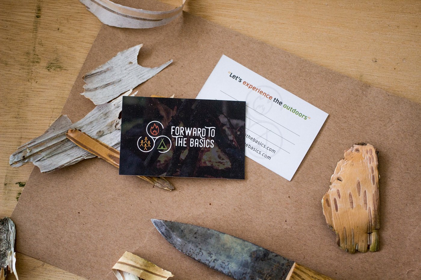
Forward To The Basics is a company that wants to let people experience the connection with nature. All kinds of outdoor activities to be and enjoy outside more. The designs for this company are my responsibility. The logo is made up of different symbols. The fire stands for food and warmth. The tipi stand for a roof over your head and a feeling of home. The group stands for the community, the family, the tribe. The three symbols are being held together by the Celtic ‘Spiral of Life’. The colours are taken directly from nature. The website is made in collaboration with Steven Bootsma
Creation:
Brand identity, Logo, webdesign, business-card.
Year:
2019


